Wednesday, January 12, 2011
Getting my hands dirty, at long last
I miss traditional drawing media and the hand-eye precision it requires, the happy accidents and discoveries you make along the way. I'm resolving to not eliminate creating original works of art from my personal work, at the very least; and, I'm trying something new, a technique outside my comfort zone. I'm taking a semester-long, studio art class to learn screenprinting. Thinking back, the last art class I'd taken that was more than a day-or-two-long workshop was back in 1997. Yikes.
After attending one of those workshops a while back, a hands-on screenprinting demo, I was excited by how easy it seemed to create a lovely product from a simple stencil. Revved with enthusiasm, I asked for a screenprinting kit as a birthday gift. I gave it a try at home and was quickly intimidated by the kit. It came with too few instructions and several mysterious solvents and chemicals. There were too many opportunities to fail without any knowledge base to troubleshoot from. Even though I tried to invite some printing-experienced friends over to help me get over my hang-ups, the craft-dates didn't materialize; I had screenprinting paralysis. The kit started to gather dust.
My first class was this past Monday night. The instructor gave us some history of screenprinting, having herself learned the technique in its American heyday back in the late '60s, early '70s. We started out with cutting a simple design out of freezer paper, attaching the freezer paper to a screen, and printing our stencil using a mix of three or more colors across the screen. We got to the business of creating our designs rather late in the class, but thankfully, I'd brought a sketchbook that had some drawings in it from when I was designing Dash's raccoon doll and was able to get something down on paper quickly. Wrapping my head around making a stencil with the appropriate negative and positive cutouts for my sketch was a little tough that late at night (the class is from 7 to 10 p.m.), but I managed it. I finished seven raccoon prints and cleaned everything up just after class officially ended. (Photos to come—sorry, we were so pressed for time, I wasn't able to get my camera-phone out with paint-splattered fingers.)
I have homework for next week's class—coming up with a high-contrast grayscale (or straight black and white) design to print out on a transparency. Looking forward to it!
Thursday, September 16, 2010
Flash Cards for Kid's Lunches
I was reading an article on Asha Dornfest's Parent Hacks blog asking parents to discuss a topic dear to my heart: How to get your child to eat more of her school lunch?Dash just started Kindergarten and while we don't yet know if he will be too busy socializing to eat his lunch (likely!), we do know that Rosie has brought home many an uneaten lunch. We have taken some steps to keep this from happening, but it's just frustrating as a parent to find that your lovingly packed lunches get ignored or discarded. I was reading through the insightful comments and saw some parents were recommending that your child pack his own lunch. My first reaction was, forget that! My kids are too young/irresponsible/unmotivated and then I stopped myself.
While they might not yet be able to physically pack their lunches, they can certainly get involved! Since Rosie eats about 50 foods total (not including variations on chocolate), we have already been to a nutritionist. I have detailed lists [OCD-alert] of her foods broken down by their nutrient content. I decided that my best option would be to make flash cards with delicious-looking images of the foods on them (because Dash is not reading—yet)!
I took my lists, my graphic design skillz (practically applied—I'm just making usable items here), and made some decisions on how to structure the cards for the kids' use. Then, I stayed late at work to print them out. Pictured is one of three pages from my layout. While the food pyramid at USDA's website is helpful, the group-breakdowns weren't set up for balancing a lunch for kids. There is a lot of information there, go look if you want.Here's my structure. I set up five categories for the kids to pick one or two each (with guidance that they needed to have at least one from EACH number group), color-coded them, and added where they fell in the USDA Groups set up:
- main course items, purple; my main course foods have the most protein, come from the USDA's meat/beans/nuts/seeds group and will help to keep my kids' energy levels high.
- fruits and veggies high in vitamins, red for fruit and green for vegetables; many of these foods are raw, just how my kids like them.
- side items, orange; are often from the grains group, but might also be a vegetable with a lower vitamin count.
- snack foods, white; treat items with higher sugar, mostly chocolate-flavored for my kids (#4 will be first to get eliminated if a previous lunch has #1-3 come home uneaten!).
- drinks, blue; my kids drink white or chocolate milk or water, no juices, so easy pickins here.

**DISCLAIMER** These cards are for my personal use; I am not selling them and many of the images I used are FPO and not licensed. Were I to sell them, I would either shoot new images or legitimately purchase the photo licenses from the image owners.
Thursday, October 23, 2008
Nylonthread, selling her wares (in public!)
My new business card, do you like it? Designing this card is only one of many reasons I've been a little quiet lately.Heedless of my better judgment, two weeks ago I signed up to be a craft vendor at a local holiday bazaar. I'm now two days and counting till my act must be together. I haven't done anything like this in 12 years (and even then, I shared a booth with a more experienced jeweler who has since made a very successful career of it).
For those of you who are local, here are the details:
October 25th, 9 a.m. to 3 p.m.
2008 Holiday Craft Bazaar
Good Shepherd Catholic Church
8710 Mount Vernon Highway
Alexandria, VA 22309
I'll have everything that's up on my Etsy site and more! This past weekend, I scoped out another craft event to get some ideas and a few things stuck with me: dramatic colors and interesting displays helped set off the items for sale; many of the vendors didn't have business cards (hence my newly designed card above); and also the vendors who had items that I was interested in did not accept credit cards. I hardly ever carry cash, and I know many people who don't as well, so I will be using Propay.com (recommended by users on a Etsy listserve I belong to) to accept credit and maybe make a few more sales that way.
Wish me luck, and stop by if you're local.
Friday, January 11, 2008
Lurkers De-Lurk!
I may regret this, but I've changed the comment feed to accept anonymous commenters, so feel free to overwhelm me with your love. Obviously, if your particular idea of affection includes spam, I will be forced to return to my "registered users only, includes OpenID" filter.
Welcome!
Today I am working from home and realizing two major issues that I have to add to my proposal for serious telework.
1. I need high-speed Internet. I had to upload/email a 2.7 MB file and it took 20 minutes. See what I mean?
2. I need a second phone line for the computer's phone connection. While my cell technically does work from my basement office if I stand on the table near the window, that is not useful if my customer wants to give me changes on the fly while I input them.
Wednesday, November 07, 2007
Art Nouveau image request
Say, here's a request to all you image junkies out there: I have been looking for an art nouveau-style image of a dragonfly.It seems that the most popular art nouveau motifs are flowers, vines, flowing fabrics, flowing hair, abstract curvilinear patterns, female figures, really fascinating typography, and astounding architectural details.
Insects, especially dragonflies, seem to me to be well suited to this style of art, with their intricate tracery in the wings, and the tapered symmetry of their bodies. Nevertheless, I have not found any satisfactory images.
I am close to attempting to draw what I have in mind myself, but for that, I would want a sample of something similar. Anyone interested in helping me with research? It's purely personal.
Saturday, October 27, 2007
Halloween Windows!

I found this crazy-wonderful idea at Aimee's site! Make cut-outs of Halloween-themed shapes, backlight your window (we have fabric pleated blinds that let light through) and you have a scary scene. I love it!
When I finally got my act together to cut out the shapes, I didn't have any reference shapes to trace, and very little time, so I just free-handed the shapes quickly and went for it. I tried to make a stencil-look for BOO on the ghost, but it looks a bit more like 300. Just imagine that it really says Boo, okay? Thanks.
Thursday, October 11, 2007
Dover Design Thursday!


In Greek mythology, Hera, the Queen of the Olympian gods and goddesses, commanded Argus to watch over Io. Io was a woman with whom Zeus - the ruler of the Olympians - had conducted a passionate love affair. However, in order to protect his mistress from the wrath of his wife, Zeus had transformed Io into a heifer. So Hera, who was quite clever, had Argus guard her rival, the heifer Io. Zeus was not pleased. He sent the god Hermes to dispatch the monster. Hermes managed to subdue Argus, and here the details differ depending on the source of the myth. Some sources suggest that Hermes lulled Argus to sleep, while others state that Hermes killed the monster.
So in the end, the nearly perfect guard creature was defeated by the wit and cunning of Hermes. Hera paid tribute to Argus by placing his eyes into the tail of the peacock, her favorite bird. In this way, Argus was immortalized, his eyes adorning the feathers of Hera's peacock.
According to some superstitions, the "eyes" on the peacock's feathers are the "evil eye" so, if you place peacock feathers in your home you will never have privacy. Kelly, I don't think that applies for paintings of peacocks, but with kids, who has any privacy anyway?
Thursday, October 04, 2007
Thursday is Dover Picture Day!
The images are beautiful, weird, historic, cute, or sometimes just confusing. Here is one that caught my eye for you today:

While we were visiting with AJS's mom (Grandma I-ko, to Dash) last weekend, he brought out this wonderful tome of Vintage Advertising cuts that had belonged to his dad. It was gorgeous! It was such a fantastic snapshot of Victorian design sensibilities, for fashion and graphics, I just wanted to rush home, scan each page and create an online archive. But, who has time for that sort of thing? There were all sorts of corset ads, not unlike this one, that AJS said he quizzically (or lasciviously) viewed many a time as a young boy.
Corsets are just fascinating creations altogether...they are just one of many, many fashion items that you only need to give a sideways glance and label, "a woman did not have anything to do with this idea."
Friday, September 14, 2007
Career meme
Instructions to the Career quiz at Careerbuilder.com:
a. Go to http://www.careercruising.com/.
b. Put in Username: nycareers, Password: landmark.
c. Take their "Career Matchmaker" questions.
d. Post the top-whatever results
1. Industrial Designer
2. Interior Designer
3. Website Designer
4. Fashion Designer
5. Cabinetmaker
6. Model Maker
7. Animator
8. Electronics Assembler
9. Sign Maker
10. Desktop Publisher
11. Cartoonist/Comic Illustrator
12. Office Machine Repairer
13. Costume Designer
14. Set Designer
15. Makeup Artist
16. Multimedia Developer
17. Exhibit Designer
18. Graphic Designer
19. Artist
20. Computer Animator
21. Musical Instrument Builder and Repairer
22. Bicycle Mechanic
23. Furniture Finisher
24. Potter
25. Boilermaker
26. Picture Framer
27. Craftsperson
28. Welder
29. Upholsterer
30. Tilesetter
31. Medical Illustrator
32. Jeweler
33. Cable Installer and Repairer
34. Carpenter
35. Electrician
36. Security Systems Technician
37. Autobody Repairer
38. Plumber
39. Gunsmith
40. Dental Lab Tech
SAVE THE SPINDLE!!
I just learned that this hilarious and attractive piece of pop art located in the Chicago suburb of Berwyn, IL is planned to be demolished. What a damn shame!Friday, September 07, 2007
Visible life alteration
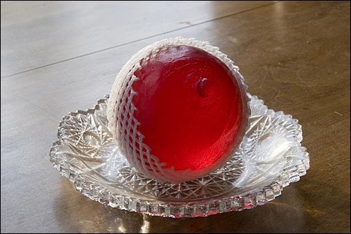
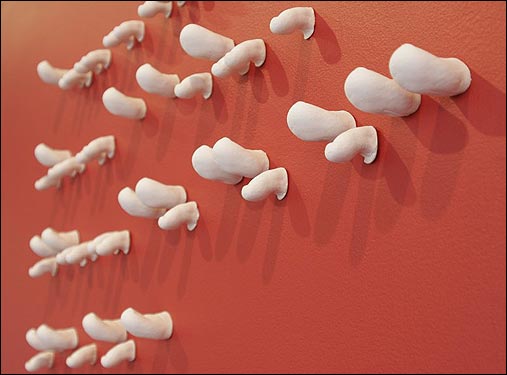
Whaaa? Are those mountains shaped like mammaries? And they're erupting with.... ack!Pregnancy and childbirth have made a huge impact on the work of these friends of mine.
Jeff and Ellen are couple that live and work in Boston as fine artists; they both went to college with me. As far as I've been keeping track of them, Jeff's work has been clever and funny, making homages to Japanese horror movies with animated vegetables, or poking fun at commercially packaged foods, while Ellen's has touched on explorations of many different subjects, many of them dealing with strangenesses in the world and bringing them into sharp focus, with humor.
Close to a year ago, they had a child; during Ellen's pregnancy, she was in awe of the bizarre transformations going on with her body, and these changes inspired her sculpture.
"Boob balls" and
Having gone through this experience twice myself, I completely understand the fascination with bodily changes, and applaud the Warmouth/Wetmores' hilarious and attractive pieces!
Friday, August 24, 2007
Yet another casualty of tax hikes: Franz Bader Books
This hit home for me today in a different way today. I was referring a co-worker with a high-school-aged son (who has an artistic bent, but needs some guidance) to Franz Bader Books, a wonderful, small, art-and-design bookstore (est. 1963) that's close to GWU's campus downtown. While searching for the street address, I found Jerry Lebo's blog and learned that it's CLOSING. This year. Within months.
If this is so widespread, what will DC look like in a few years? Will we even recognise it?
Here's a link from DCist.com that tells you how AJS really feels.
Tuesday, August 14, 2007
Helvetica turns 50
Eduard Hoffmann.
Rock stars they are not. Nevertheless, in 1957 these Swiss typeface designers created a sans-serif that shaped our world. In high school, I used press-on type sheets labeled "Helvetica" (and thought, WTF does that mean?) for random projects. In my Advanced Typography college courses, we were given multiple heirarchy-building projects that used every weight and nuance of Helvetica imaginable. Helvetica got me my first design job.
And now there's a movie about it!
Even so, it's not my favorite typeface. Most electronic versions of it, especially on PCs, have awful kerning and spacing issues, like the programmer just didn't feel the love. I am still all about giving the props to the designers! However we butcher Helvetica 50 years later is not their fault.
Thursday, June 07, 2007
Gaaack?!?
And, whaaaa? After staring at the graphic for several minutes and trying to glean a deeper meaning from the British 2012 Olympics' new logo, I have come to a conclusion. There is none. The hot pink disaster is a jaggy, "extreme," stacked-and-teetering version of the numerals 2,0,1, and 2.No epilepsy here, but the ick-factor is hurts mi brain.
Tuesday, May 29, 2007
Playset design for beyond preschool
So, what is there when your 8 to 12 year-old is bored with your playset that was designed to keep a 4 year-old entertained? Some architects and conceptual artists envision "new spaces to stimulate the imagination (and the metabolism) by encouraging exploration and free play."
http://www.nytimes.com/2007/05/29/opinion/29arieff.html?_r=1&oref=slogin
The writer mentions that she has asked other designers for input. I'll keep my eyes peeled.